Apple's Pursuit of Healthy Digital Habits: Why Vision Pro Doesn't Align

Apple’s Pursuit of Healthy Digital Habits: Why Vision Pro Doesn’t Align
Quick Links
- Enter the Vision Pro
- Bedtime, 2016
- Screen Time, 2018
- App Limits, 2018
- Downtime, 2018
- Focus Mode, 2021
- Notification Summary, 2021
- Screen Distance, 2023
In recent years, Apple has released “Digital Wellbeing” features to encourage healthy usage habits with the iPhone and iPad. But with the Vision Pro headset , Apple wants to put two 4K displays inches from your eyes. What’s the deal?
Apple has rolled out several features over the years aimed at helping people have a healthy relationship with its devices, and even use them less. After years of digital well-being messaging, the Vision Pro feels like such a sharp departure from that. There’s no getting around the fact that Apple is now asking you to put displays inches away from your eyeballs for hours at a time.
Enter the Vision Pro
The Vision Pro isn’t, if we’re being technical, a “real” augmented reality device. Unlike the Microsoft HoloLens , the Vision Pro has no real transparency. You’re not looking through clear lenses at your real-life environment—it’s being displayed on screens in real-time from the cameras. Even if you want to get out of the virtual reality space, you’re still not looking at the real world.
Then there’s the bizarre scene of the dad and his kids in the promotional video (1:59). The Vision Pro can record videos in 3D and then you can then watch back in 3D with the headset. Recording high-resolution 3D video and enjoying it with proper immersive 3D playback is quite cool, to be sure. But the promo video showing the dad wearing the Vision Pro and recording his kids playing struck a weird chord with many people. Wearing a pair of futuristic goggles feels far more disruptive and less “in the moment” than pulling out your phone, to be sure.
The Vision Pro is clearly a very different type of experience than we’ve ever seen Apple advocate. In light of that, let’s take a walk down memory lane and look back at all the Digital Wellbeing features Apple announced before encouraging you to strap a screen to your face.
Bedtime, 2016

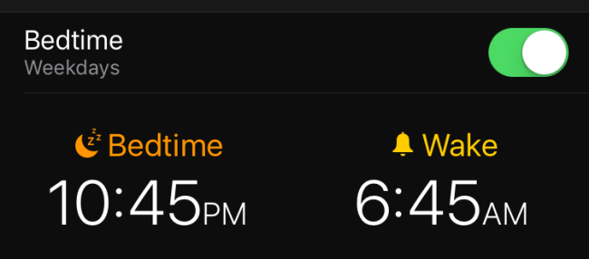
In iOS 10 , Apple announced a slew of “Bedtime” features that were added to the Clock app. It would remind you when it’s close to your bedtime, wake you up at an optimal time, and had gentler wake-up sounds.
The “Bedtime” tab has since been removed from the Clock app, but Apple didn’t abandon the features. In fact, they evolved on them with Focus Mode and Downtime. This was just the beginning of Apple incorporating and promoting features focused on healthy usage habits.
Screen Time, 2018

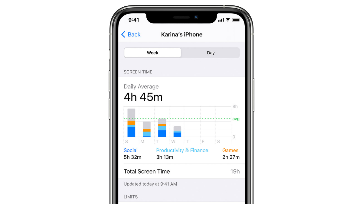
2018 was a big year for Digital Wellbeing on the iPhone and iPad. “Screen Time ,” included in iOS 12 , introduced a new tool for keeping tabs on how much you were using your device. In many ways, this is the feature that kicked off the Digital Wellbeing trend that spread to other devices and pushed the concept more firmly into public consciousness.
Screen Time shows how long your screen has been on each day, which apps you used the most, and how your usage changes over time. It can give you weekly reports on how much you used your phone compared to the previous week, too.
This was a pretty interesting feature for Apple to release. Screen Time really shines a light on how much you use your phone, which could encourage people to use Apple’s products less. Bold move for a company to include a feature that leaves you saying, “Wow, I need to put this thing down.” Screen Time is still present in iOS and iPadOS.
Related: How to Check Screen Time on iPhone
App Limits, 2018
Another part of iOS 12 and Screen Time was “App Limits .” As the name implies, this feature allows you to limit how long you use certain apps each day. The time is completely customizable, and it can even be set for specific days as well—allowing you easily, for instance, curtail your Instagram habits during the work week but leave Sunday wide open for lazy scrolling.
Similar to Screen Time, this was another really interesting feature rollout from a company that greatly benefits from people using their phones. It showed that they were more interested in people having healthy usage habits, and stepping away from their devices instead of staying head down in a stream of apps all day. App Limits are also still available today.
Related: How to Set an App Time Limit on iPhone and iPad
Downtime, 2018
Yet another digital wellness feature announced in 2018 was “Downtime ,” which persists to this day on the iPhone and iPad. Downtime is one of the most powerful tools Apple has created to encourage healthy usage habits, even if it is a bit cumbersome to set up.
Downtime essentially blocks certain apps during specified times. For example, maybe on the weekends you don’t want to be tempted to check the apps you use for work. If you add them to Downtime, you won’t be able to open them, and the app icons are even faded on the home screen to indicate that they can’t be used.
Related: What Is Downtime on iPhone, and How Do You Turn It Off?
Focus Mode, 2021

With iOS 15 and iPadOS 15 , Apple revamped the archaic “Do Not Disturb” feature and introduced “Focus .” Essentially, Focus allows you to create multiple “Do Not Disturb” modes for specific activities and situations.
The old Do Not Disturb function was a big catch-all that wasn’t particularly useful for more than bedtime. You were either dead to the world (save for specially designated contacts) or you weren’t. Focus is an incredibly handy and far more flexible tool for making your phone less intrusive. You can actually create different lock screens and home screens for each Focus mode, which is super cool.
Focus modes are still a big part of iOS and iPad OS, and there’s more to it than you can imagine. It’s really worth checking out if you haven’t already .
Related: You Should Be Using Focus Mode on the iPhone
Notification Summary, 2021

Notifications can be one of the biggest annoyances on an iPhone or iPad, which is why iOS 15 and iPadOS 15 added a feature called “Notification Summary .” The concept is pretty simple—you can get your notifications grouped together at certain times instead of immediately as they come in.
It’s a handy tool for reigning in notifications without completely disabling them. You can set up how many summaries you want throughout the day and which apps get put into the summaries. It doesn’t stop “Time Sensitive “ notifications from appearing, so you don’t have to worry about missing important stuff.
Related: How to Set Up Notification Summary on iPhone and iPad
Screen Distance, 2023

Apple
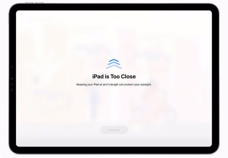
The most recent addition to Apple’s suite of Digital Wellbeing-centric features was announced alongside iOS 17 and iPadOS 17 , called “Screen Distance.” The feature is as literal as it sounds—it measures the distance from your eyes and the iPhone or iPad screen.
When the iPhone or iPad detects that the user is holding the device too close, a screen appears with a message that says, “iPhone is Too Close.” After you move it farther away, you can dismiss it and continue using the device again.
You would not be alone in thinking it’s odd that Apple announced a feature to prevent people from holding a screen too close to their eyes moments before announcing a headset that puts screens inches from their eyes.
Apple’s Digital Wellbeing mission hasn’t been a one-off feature here and there. This has been a consistent theme over the last several years. The Vision Pro is a lot of things but it certainly stands out as a strange departure from the wellness messaging we’ve seen over the years. Apple wants you to create better bedtime habits, monitor your screen usage, limit addictive apps, keep distracting notifications at bay—and then put on ski goggles on your face to record your kids playing. I’m getting mixed messages.
- Title: Apple's Pursuit of Healthy Digital Habits: Why Vision Pro Doesn't Align
- Author: Nova
- Created at : 2024-08-27 18:53:54
- Updated at : 2024-08-29 10:22:36
- Link: https://blog-min.techidaily.com/apples-pursuit-of-healthy-digital-habits-why-vision-pro-doesnt-align/
- License: This work is licensed under CC BY-NC-SA 4.0.